
Integrating Wero payments
The bank wanted to integrate Wero to replace Payconiq. The UX challenge was not the payment interface, but the onboarding: how to link the Wero app to the banking app and manage all account eligibility cases without losing the user?

Objective
Let customers link their accounts to the Wero payment service, covering every eligibility case, and set up a KPI framework to measure adoption.
Impact measured in production (Friends & Family), no UX issues reported
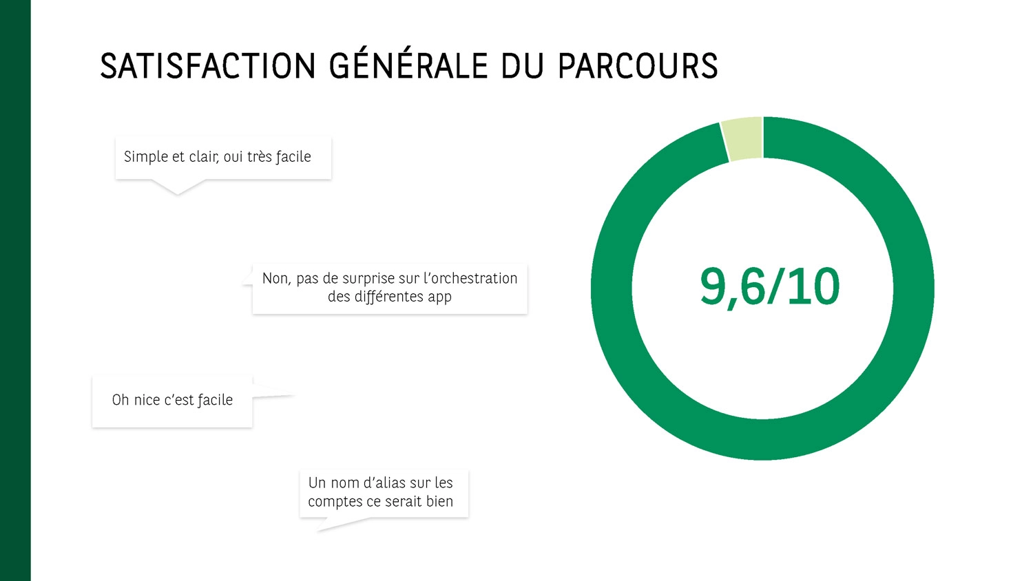
9.6/10
Overall score in user testing (n=6)rating flow fluidity
100%
of eligibility casesEach with a contextual message and a clear exit (eligible, ineligible, already linked, no compatible account)
2
Target audiences addressedRetail & Wealth Management
The problem
Wero replaces Payconiq in Luxembourg and fixes two structural frictions of the old solution: Payconiq was declined into one app per bank (a source of confusion), and required an activation that forced leaving the mobile device to scan a QR code on a desktop, incoherent for a 100% mobile service.
The bank wanted to integrate it into its app to allow its customers to pay without sharing an IBAN.
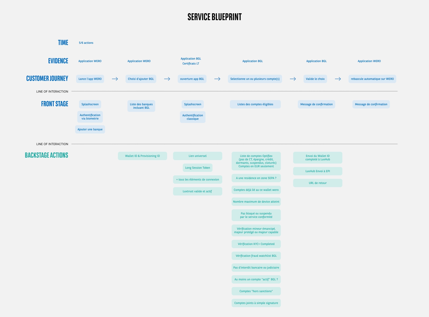
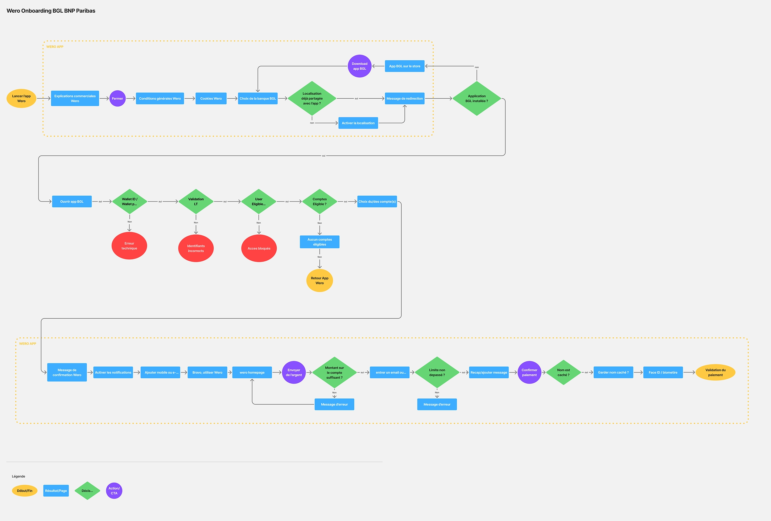
The main difficulty was not the payment itself, it was linking the accounts: onboarding takes place in the Wero app, then the user is redirected to the banking app to choose which accounts to link.
Approach
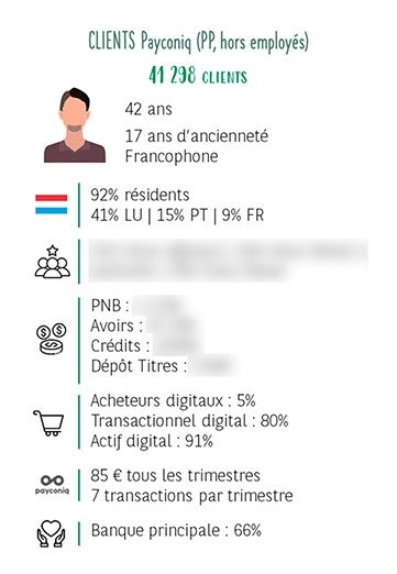
Leveraging Payconiq data before designing.
Before designing, I leveraged Payconiq's usage statistics to build personas based on real data, not assumptions. I also found that no KPI framework existed to track adoption, and proposed a set of indicators to the Payments tribe (see key decisions).
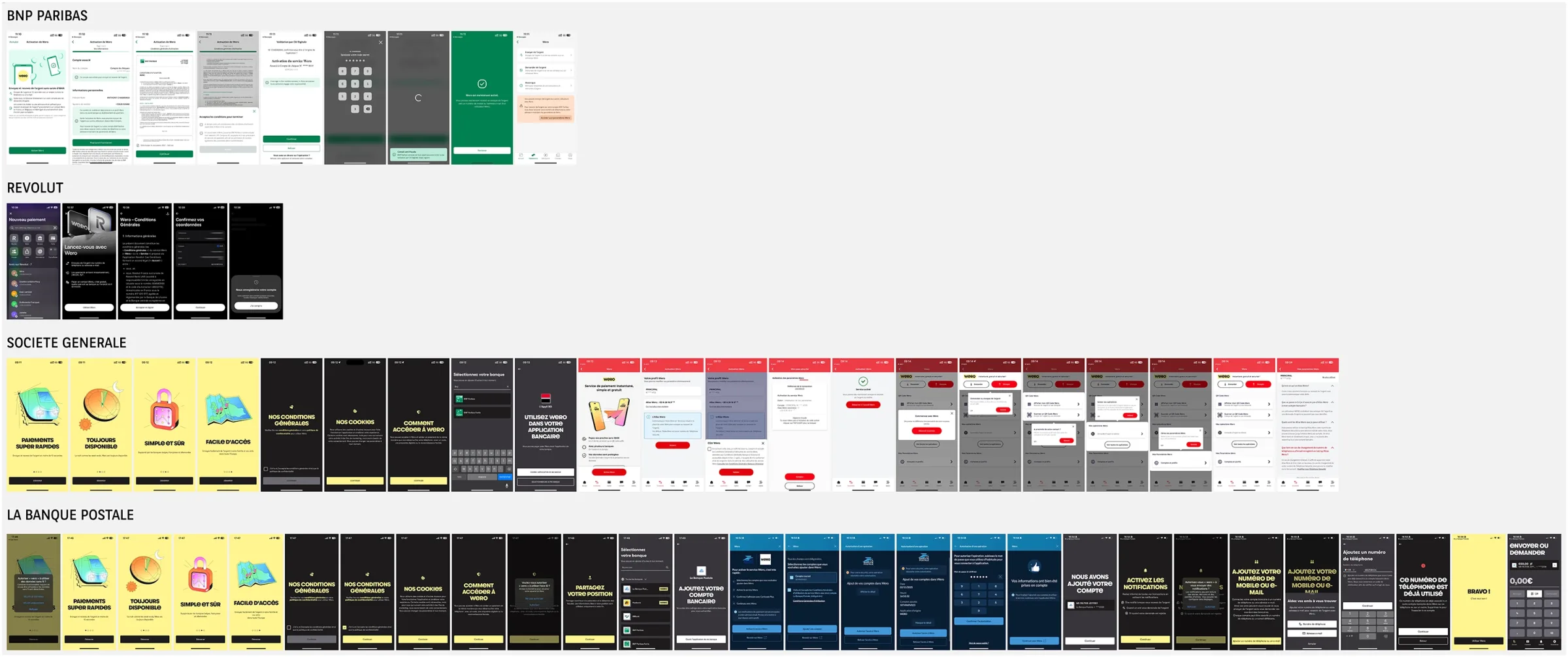
Benchmark Wero implementation across competitors
The finding was notable: La Banque Postale was the only one, like us, to do onboarding via the Wero app before redirecting to the banking app, the others integrated directly. This rare case steered the benchmark towards formulations and good practices for user guidance rather than towards integration patterns to reproduce.
Map the junction point with the Wero app
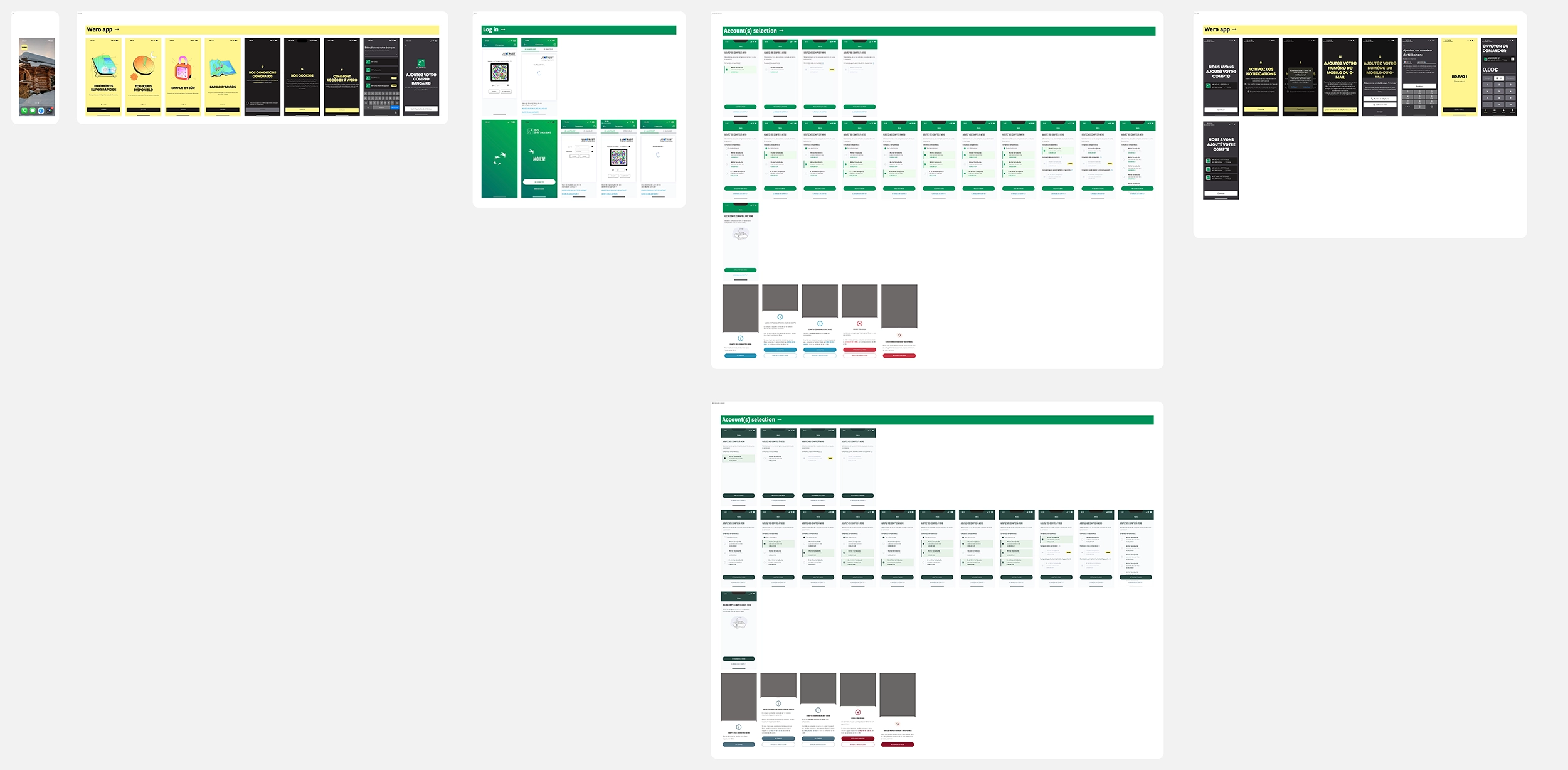
I analyzed the Wero onboarding screens to understand exactly where their scope ends and ours begins. This mapping directly fed the user flow and the blueprint, an indispensable condition to ensure a clear transition at the junction of the two apps. Each use case has a contextual message and a clear exit.
Test on prototype then adjust
I tested a high-fidelity prototype with 6 participants, some accustomed to Payconiq and some not. Score of 9.6/10, with a unanimous sense of fluidity despite switching apps midway through the flow, which was the riskiest point.
Adapt for the Wealth Management target
I adapted the flow for the Wealth Management target, which has its own application with specific branding and translations (e.g., Dutch).
Key decisions
Proposing a KPI framework that didn't exist.
Onboarding tracking was the obvious part, but no one had planned to measure how the user profile evolved after migrating from Payconiq. I proposed a full framework to the Payments tribe: average age, average transaction amount, transactions per user, failure rate, full onboarding rate. And a strategic indicator: the Android vs iOS split, to measure Wero's impact against Apple Pay and Google Pay over the long term.

Treat the junction point as a design constraint.
The transition between the Wero app and the banking app is the most fragile moment of the flow. Mapping it precisely allowed for designing an entry into the banking flow that is immediately readable, without assuming the user understands what they are coming to do.
Cover exclusion cases with as much care as the happy path.
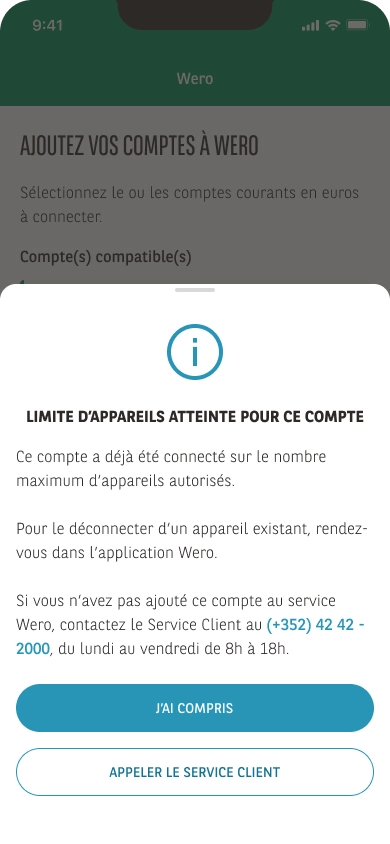
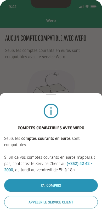
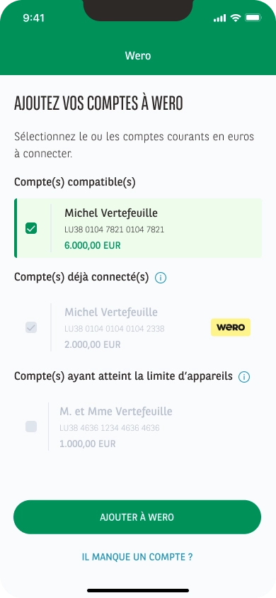
An ineligible account, an already registered device, no compatible account, each case has a message that explains the situation and offers a way out. Never leave any user without an understandable answer.
Design the Wealth Management version as a consistency constraint.
Same flow logic, adapted content, and addition of Dutch, so that both targets benefit from the same level of quality without one serving as a degraded version of the other.
Results
The flow covers all identified use cases and obtained a 9.6/10 in user testing, with a unanimous feeling of fluidity despite the technical complexity of the service.
The KPI framework proposed to the Payments tribe is in place as a tracking baseline from the production release; initial data will help measure user profile evolution and Wero's impact compared to native wallets (Apple Pay/Google Pay).
The components designed are reusable for other upcoming payment services.
Key takeaways
"Designing at the junction of two systems requires understanding both, even the one you don't control. Mapping Wero's onboarding before designing the banking part avoided false assumptions about what the user knows and expects upon arrival."
"KPIs are not a responsibility that stops at business data. Proposing a measurement framework upfront ensures that the design work can be evaluated, and that future iterations will have a solid basis for decision-making."