
Boosting the App's NPS
The NPS had stagnated at +26 for two years. By analyzing the verbatim feedback, I identified that the login flow, 30 seconds of waiting every time the app opened, was the top irritant to address.
Objective
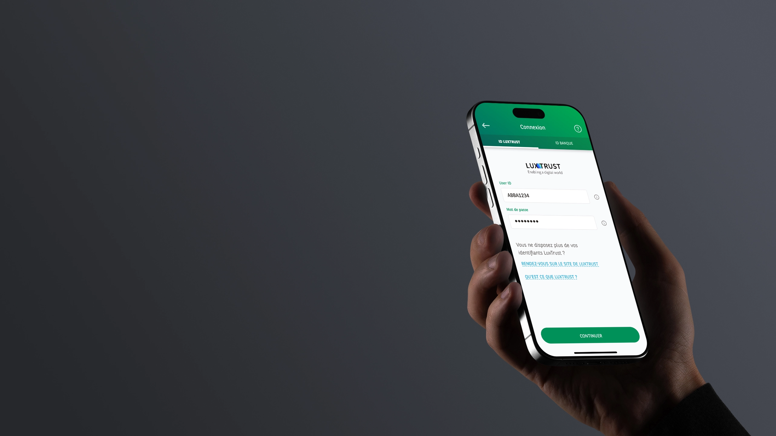
Improve the NPS by redesigning the login flow (UX, UI, and wording) alongside its technical rewrite by the developers.
Impact of the full rebuild, UX and engineering · H1 2025 vs H1 2024
+30
App NPSwas at +26
4.6
App Storewas at 2.2
4.4
Play Storewas at 3.4
÷3
Login time30s → 10s
-95%
Session bugssince go-live vs 39 reported in H1 2024
The final flow, on video
The Problem
The NPS had dropped 4 points between 2022 and 2024: +30 (2022) to +26 (2024). By cross-referencing store reviews, customer service feedback, and analytics, I isolated the main irritant: the login flow.
51 negative reviews about login in H1 2024, 39 reported session bugs, and code that had grown increasingly complex with each OS patch to the point of being hard to maintain.
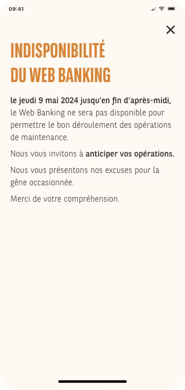
Error messages, generic "technical error" messages, didn't help users get unblocked.
My hypothesis: rewriting the flow from scratch, code and UX together, rather than stacking more patches, could lift the NPS again. As the only designer on the project, I co-led the effort with the developers from the design phase onward.
Approach
Mapping the existing flow, because no one had done it before.
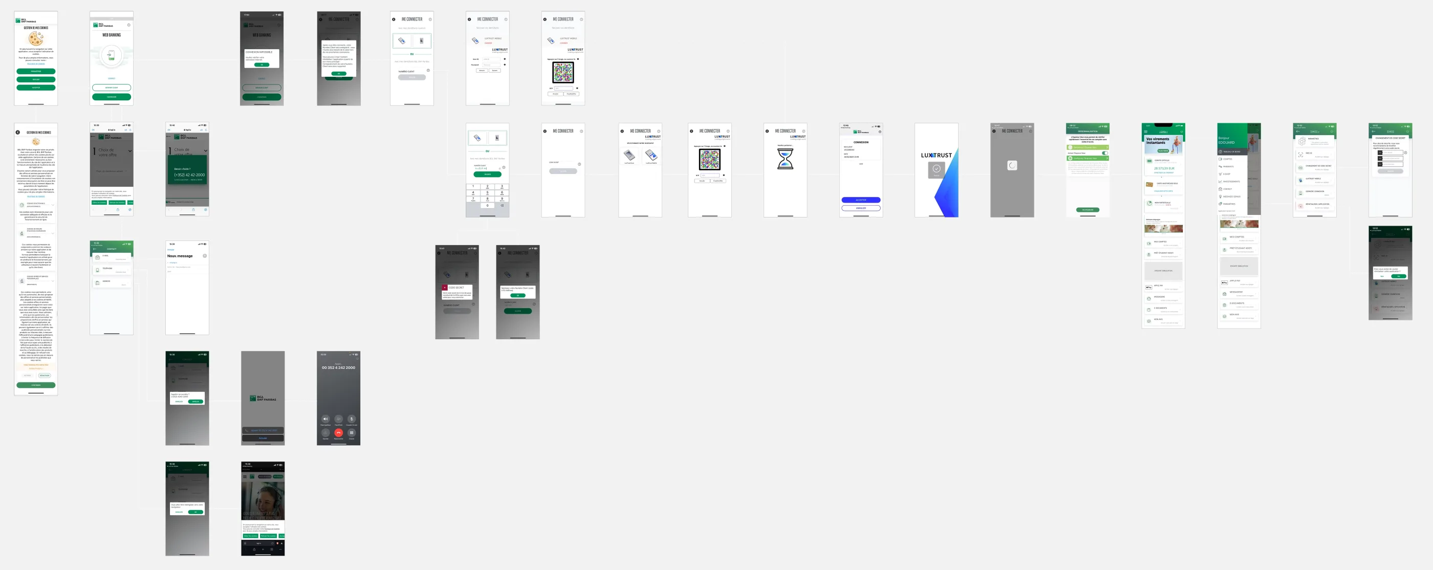
No UX work had ever been formalized for this flow, despite how critical it was. I rebuilt the complete as-is from app screenshots to map every screen, the covered cases, and above all the blind spots, before proposing anything.
Modeling the flows with developers before designing.
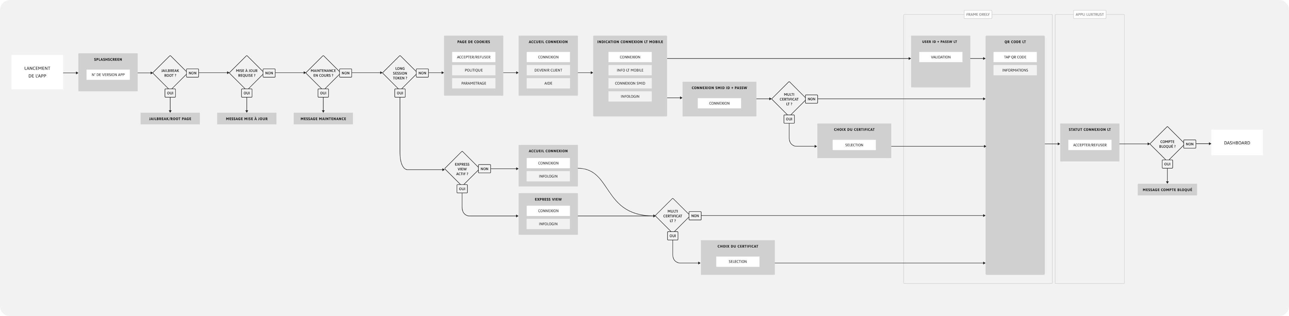
Two distinct flows to cover (1st login and subsequent logins), dozens of possible error cases (timeout, rooted phone, connection lost, maintenance...), and a strict dependency on Luxtrust Mobile imposed by security.
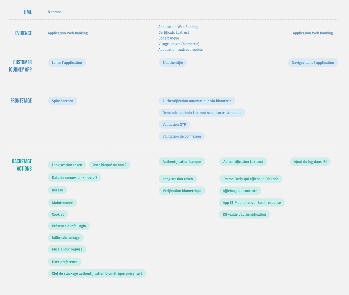
I built the user flow and the service blueprint with the developers before touching a single screen. Their first blueprint ever. It gave the whole team a shared view of what happens and when, and directly informed the code rewrite: several steps of the flow could be moved earlier or later. The blueprint has since become a team reflex on every major project.
Treating errors as a design opportunity.
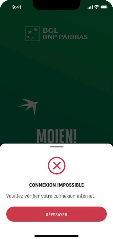
I replaced generic "technical error" messages with contextual messages that explain the problem and offer an action. Every critical case, timeout, rooted phone, connection lost, maintenance, temporary customer service code, got its own dedicated screen with carefully crafted wording.
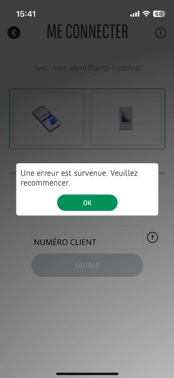
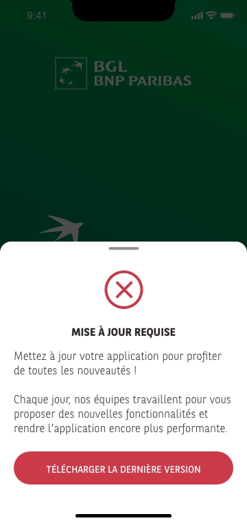
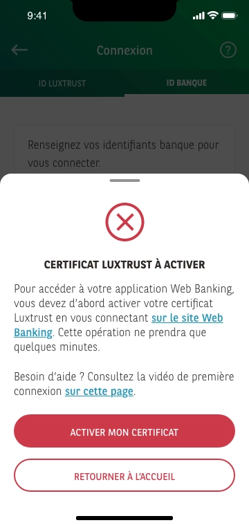
Contextual messages that explain the problem.
Validating with representative user profiles.
7 participants recruited across 3 familiarity levels: regular app users (3), partial familiarity (2), and prospects with no experience of the app or Luxtrust (2).
Results: 100% success rate on the flows, 7.8/10 satisfaction, and 100% easily found help when stuck.
The only major friction identified came from the Luxtrust interface itself: a QR code you tap instead of scan, against the expected gesture. The rest of the feedback came down to a few wording adjustments. Outside my scope, but not outside the customer journey: I documented the issue and brought it to the Luxtrust teams.
No difficulty logging in, it's seamless.
Regular app user
It's quite smooth and the information is clear.
Partial familiarity
I had some questions about Luxtrust, the QR code isn't intuitive.
Prospect
Leading a two-phase rollout.
Deployment in two phases: first a restricted Friends & Family circle (~1 month) to catch any UX irritants, then a full rollout. No blocking UX feedback during the pilot phase.
In parallel: spec annotations, Design Quality Checks, tracking discrepancies between mockups and implementation, and updating the store visuals (iPhone, iPad, Android × 3 languages) to align the product promise.
Key Decisions
Choices challenged and settled in team design reviews, twice a week, then documented.
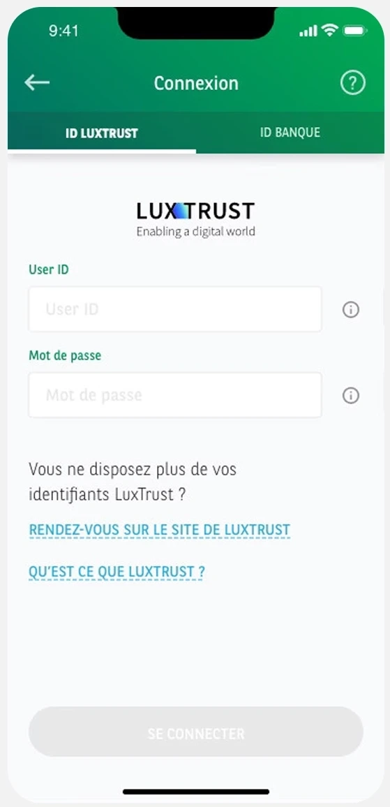
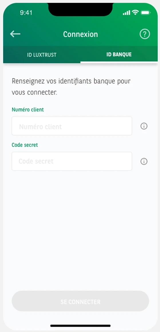
Restructure the login page.
Analytics showed that the vast majority of users logged in via Luxtrust Mobile, but the old page presented both options at the same level, creating confusion. I restructured the page to reflect actual usage: Luxtrust Mobile as the primary option, bank credentials in a secondary tab. I also added contextual help, "What is Luxtrust?", for newcomers to Luxembourg. This choice reached beyond the app: around 500 clients were still using the physical token. Their migration to Luxtrust Mobile was supported by a campaign built with the marketing team ahead of the switch.
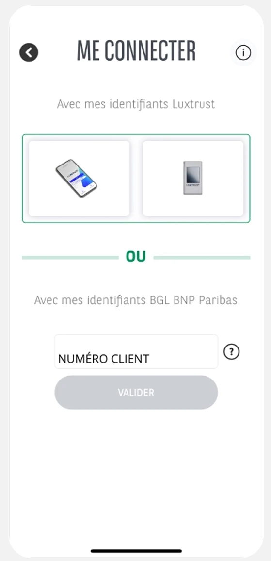
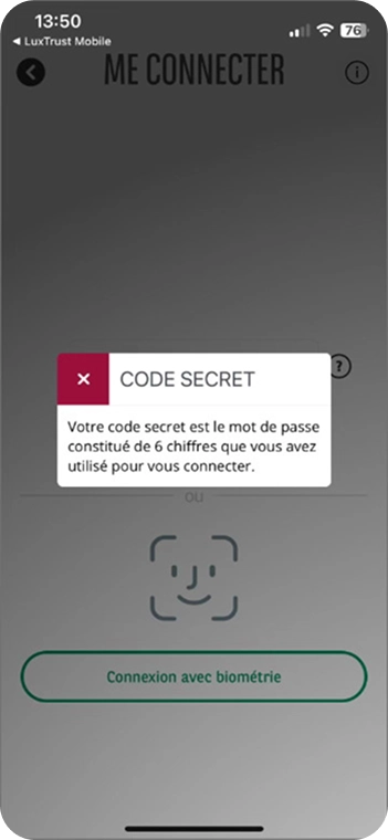
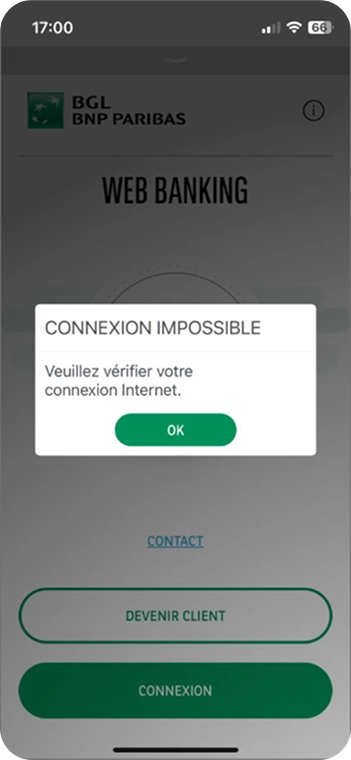
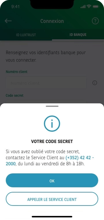
Replace pop-ups with bottom sheets.
I replaced the web-legacy pop-ups, which were visually inconsistent with each other (some closed with a red cross, others with an "OK" button), with native bottom sheets, in 4 semantic variants depending on context. The component came from the Online Appointment project: I extended it to cover the login cases, and that consolidated version has equipped every new project since. A shared component that gets stronger with each project, rather than one more local variant.
Redesign the infologin.
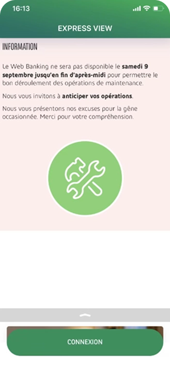
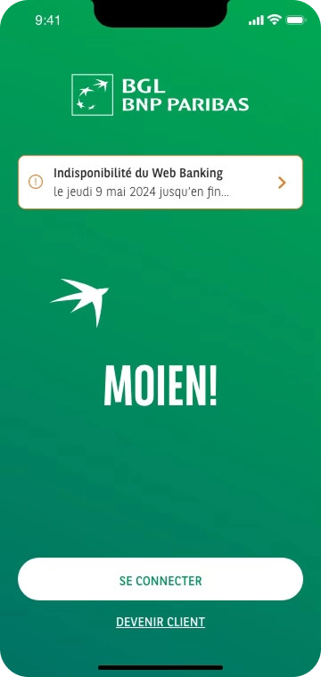
I replaced the mandatory information page shown at every login with a contextual card that is less intrusive and can be consulted on demand.
Key Takeaways
Cross-referencing store reviews, analytics and customer-service feedback before designing is what let me isolate the right lever.
Co-building the userflow and blueprint with the developers before the first screen removed back-and-forth during delivery.
Error messages are design work in their own right: replacing a generic 'technical error' with an actionable message directly moves the NPS.