
Personal loan online
Simulate your loan, upload your documents… then print, sign, scan, or travel to a branch. This 3rd iteration finally closes the loop: a personal loan request you can complete end to end, 24/7, from simulation to electronic signature, with a file saved and tracked at every step.
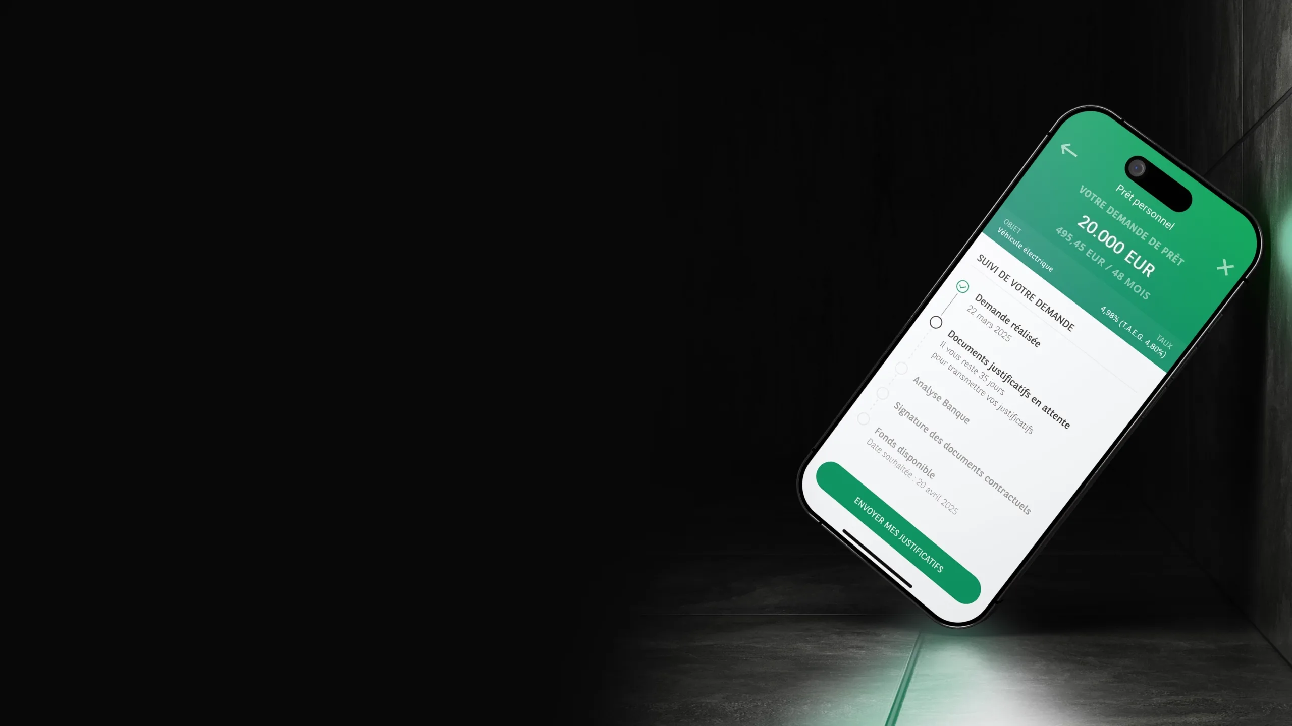
Objective
Let customers complete a personal loan request entirely online and 24/7, from simulation to signature, while offering clear file tracking and reducing the friction of a long, sensitive journey.
Impact
1.6/5
Customer Effort Score in productionmeasured with 130 customers, against an OKR set at < 2
−35%
Of customer-service callson the personal loan topic since going live
18% → 38%
Of supporting documents uploaded onlinedocument upload more than doubled since the redesign
The Problem
A customer could already simulate their loan and upload their documents online, but the journey stopped just before the end: once approved, they had to travel to a branch to sign, or print the contract, sign it, scan it and send it back. Time-consuming steps, for the customer and the bank alike.
Analytics confirmed other friction: a clear drop-off at the summary, right before uploading documents; no save if the customer paused, forcing them to start over; and after sending the documents, no visibility at all, they waited for the bank's answer without knowing where their file stood.
Adding the online signature therefore meant hardening the entire file tracking: saved from creation, joint borrowers synchronized between two borrowers each signed in on their own phone, handling refusals and ineligibility with a bridge to a branch appointment. All with a non-negotiable deadline: the late-January Autofestival, a strategic period for car loans in Luxembourg.
Approach
Analyze the existing flow and the analytics of the two previous versions
Usage data from the previous versions showed a drop-off at the summary, right before uploading documents, and an outright loss of unfinished files for lack of a save. These two findings shaped the whole design.
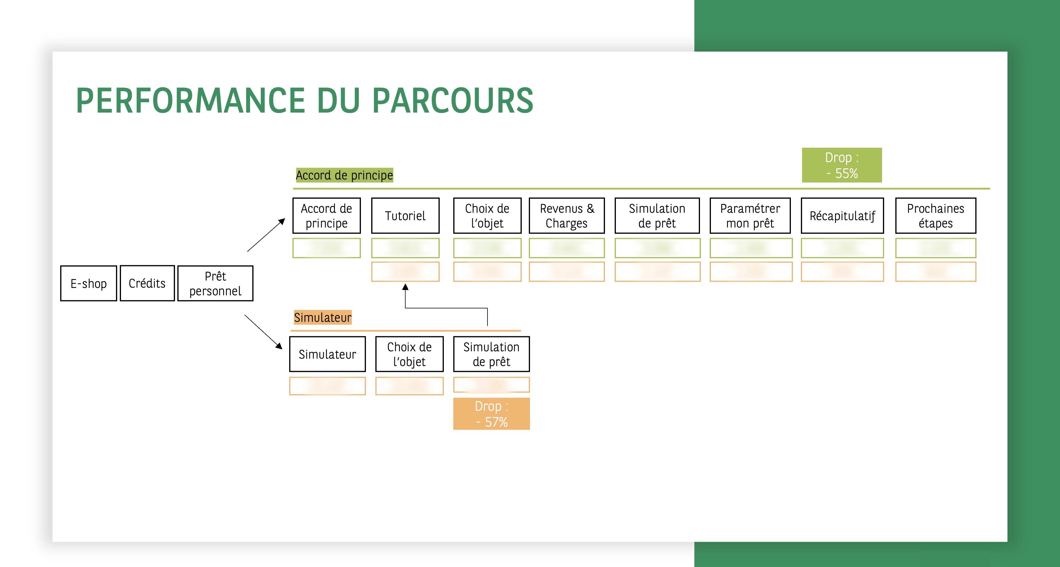
Frame the signature with the Credit tribe, IT and LuxTrust
Close work with the Credit tribe and IT to understand COSI, LuxTrust's electronic signature solution, and its edge cases: joint borrowers, ineligibility, refusal.
Test first on wireframes
Moderated test with 6 participants of varied profiles: 8.2/10. Key insight: announcing a 'reply within 1 to 2 weeks' put off more than half the testers. Raised with the advisors, this feedback led to a commitment to reply within 3 days, and to announce any refusal in person, by an advisor, rather than by notification.
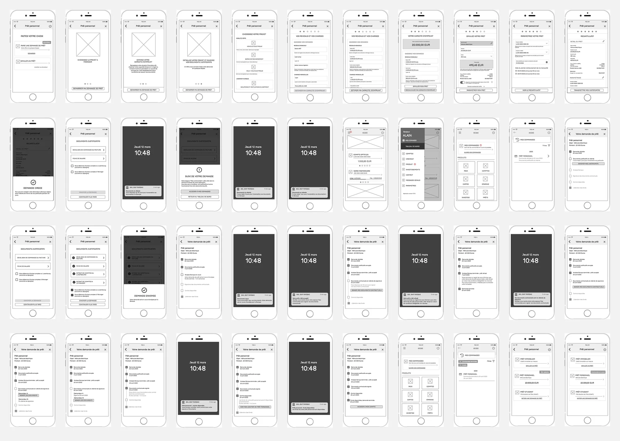
Design a complete track & trace
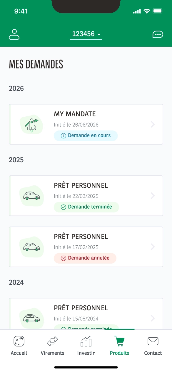
Benchmark of tracking best practices to define states, dates, action links and visual logic, then design of a 'my requests' tracking space that saves the file from creation and carries it through to signature. No more requests lost along the way.
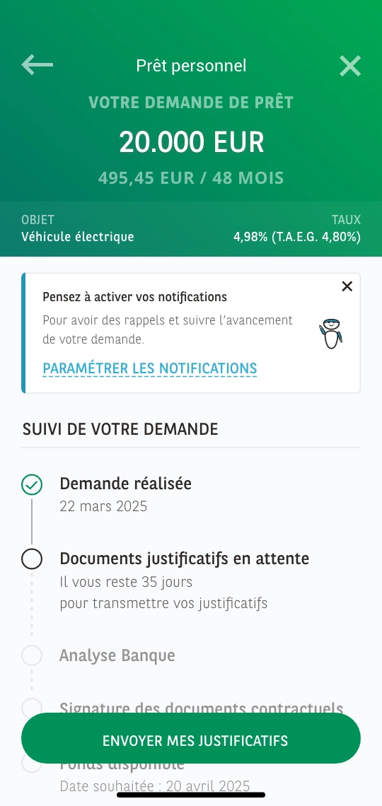
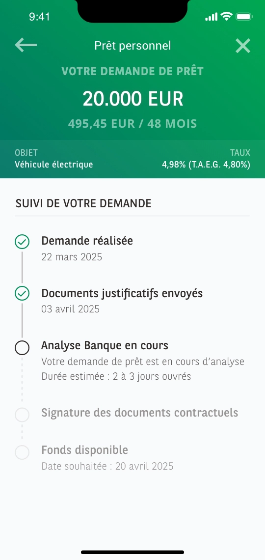
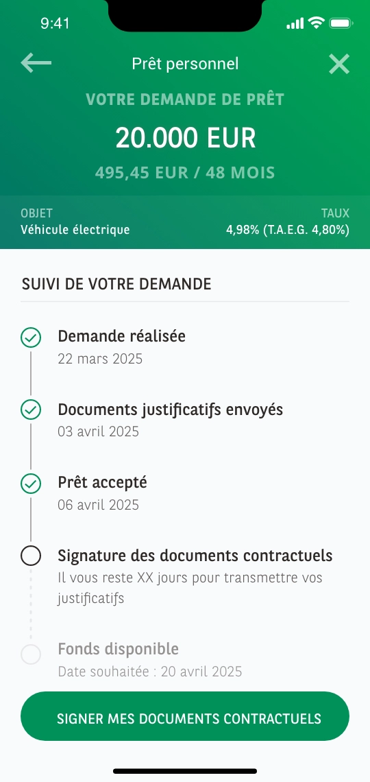
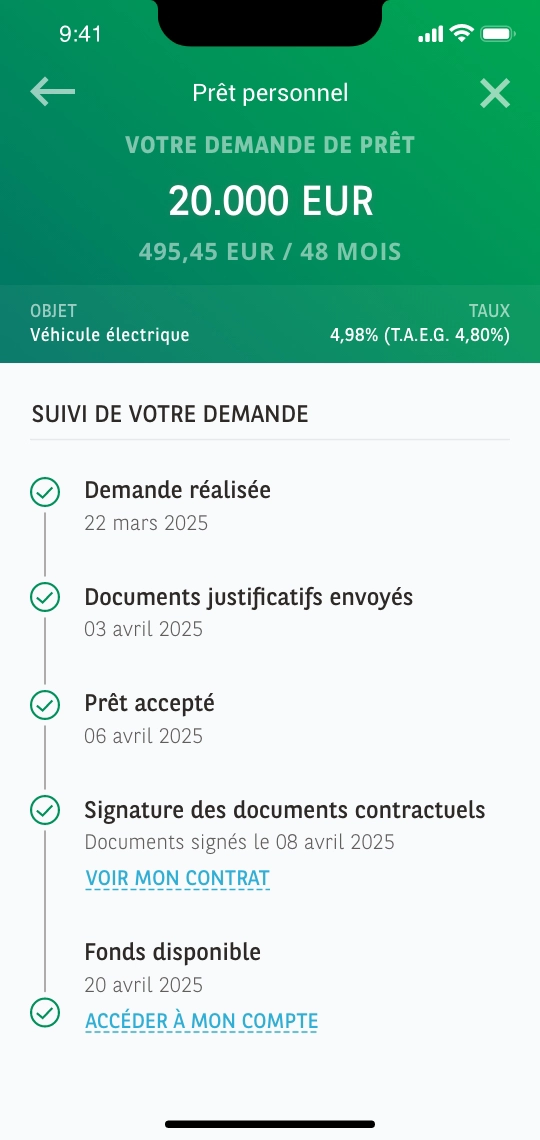
Time notifications at the right milestones
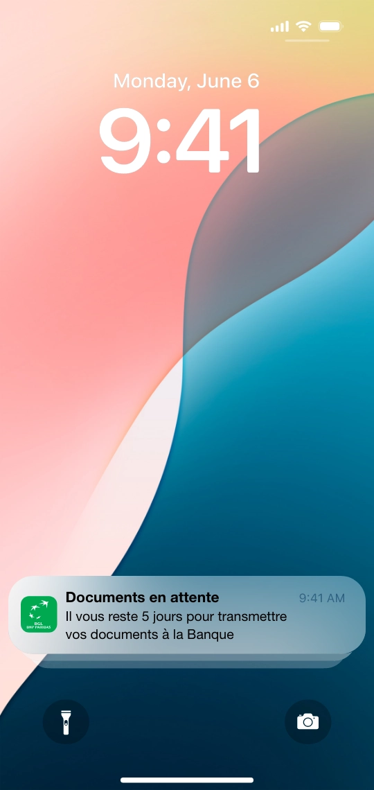
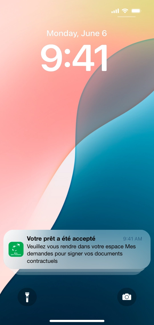
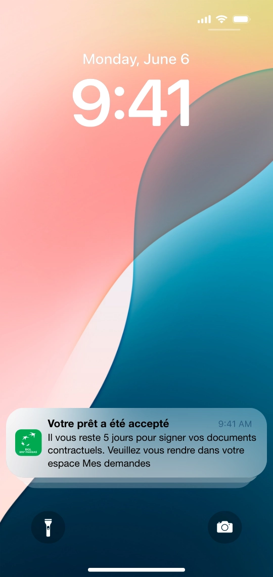
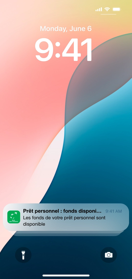
Notifications at each key step: confirmation, document reminders, signature reminders, so the customer never loses track of a journey that spreads over time.
Finalize the UI, prototype and re-test
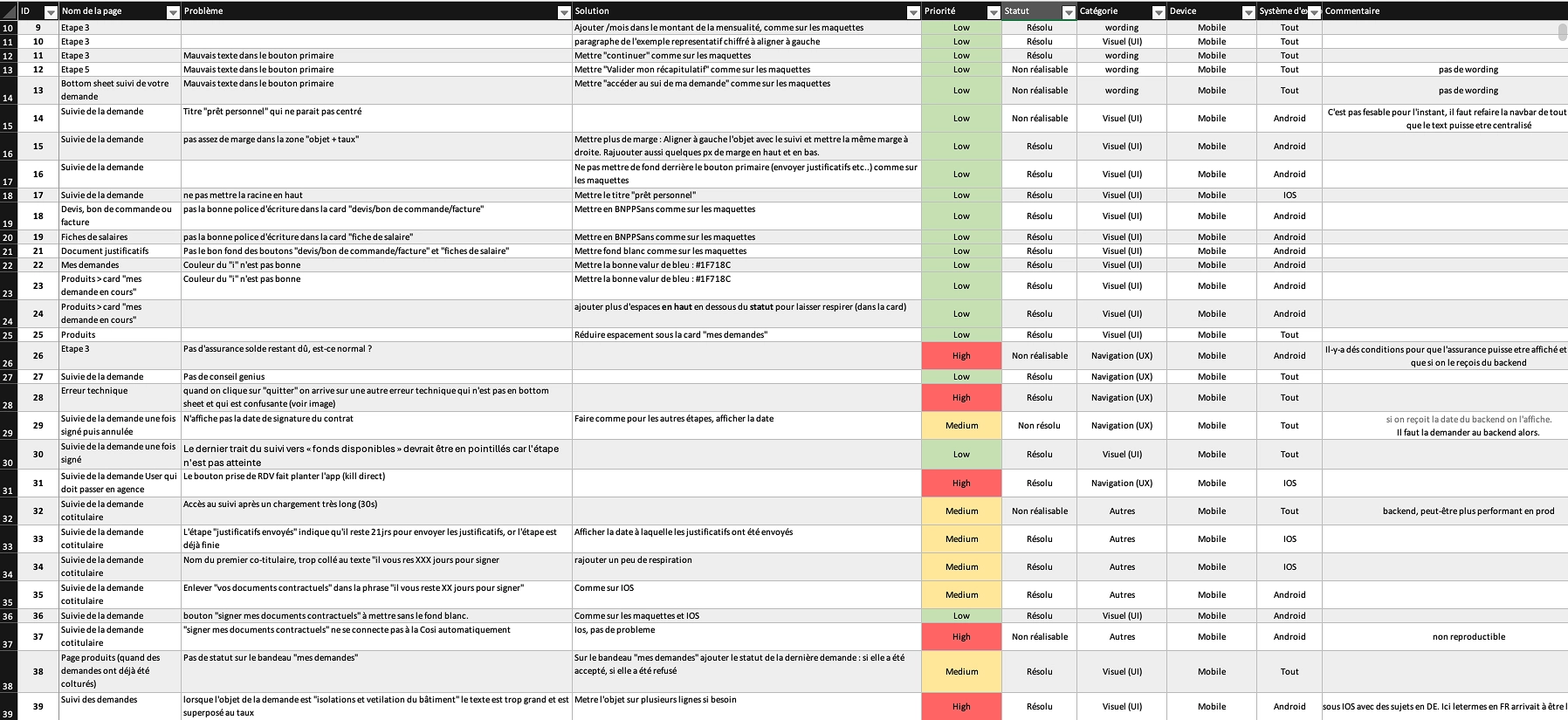
Moderated test of the final prototype with 6 new participants: 8.7/10. Two pieces of feedback actioned: the list of documents to provide, added right from the tutorial, and the readability of contracts in COSI, raised with LuxTrust for their next version. 'Not many clicks, so it's really good.' Then DQC to ensure Android / iOS consistency and preparing translations before going into production.
Seeing my loan tracking will save me from calling customer service
It's really good that you can continue the request later, we don't always have all the supporting documents with us
The notifications help me follow the process
Key Decisions
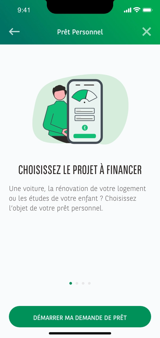
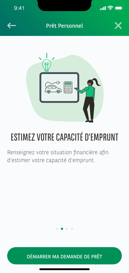
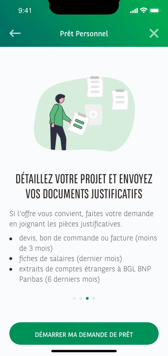
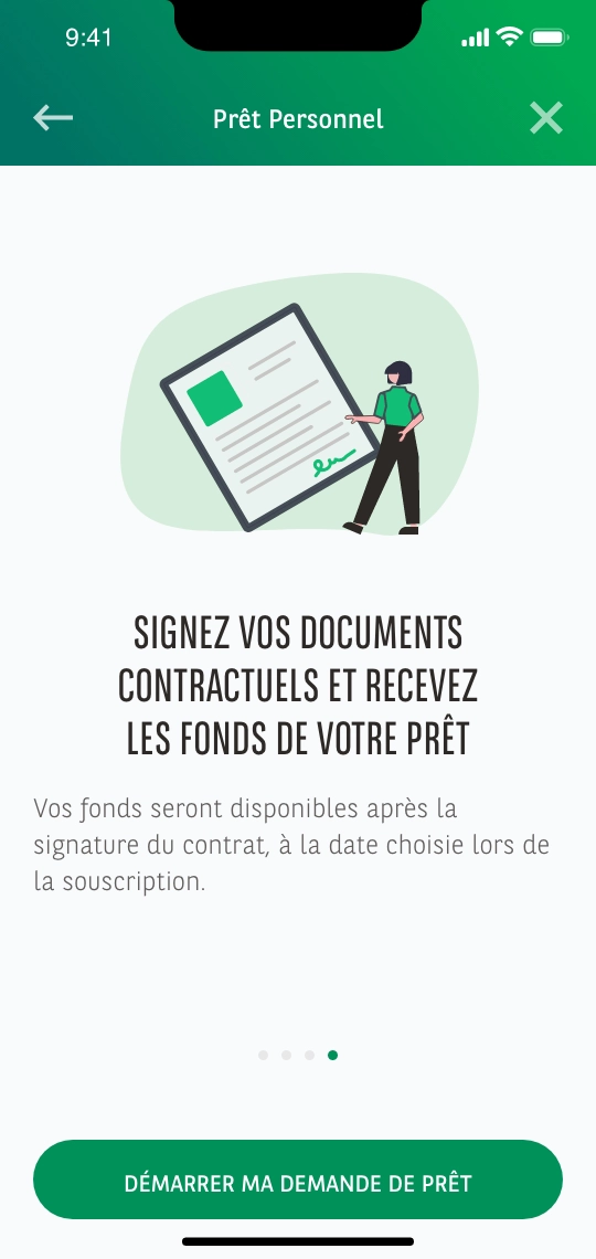
Add an illustrated tutorial including the signature
The journey was gaining a major step. I added an illustrated tutorial upfront to lay out the steps, online signature included, and, after testing, the list of documents to prepare. The customer knows where they're going and what's expected of them before committing.
Make the signature the natural end of the flow
Rather than a break toward the branch, the signature becomes the last logical step of the online file, with a clear exit toward a branch appointment for ineligible cases.
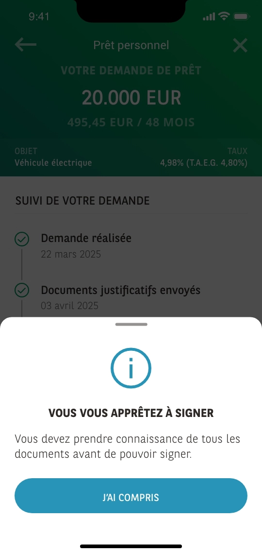
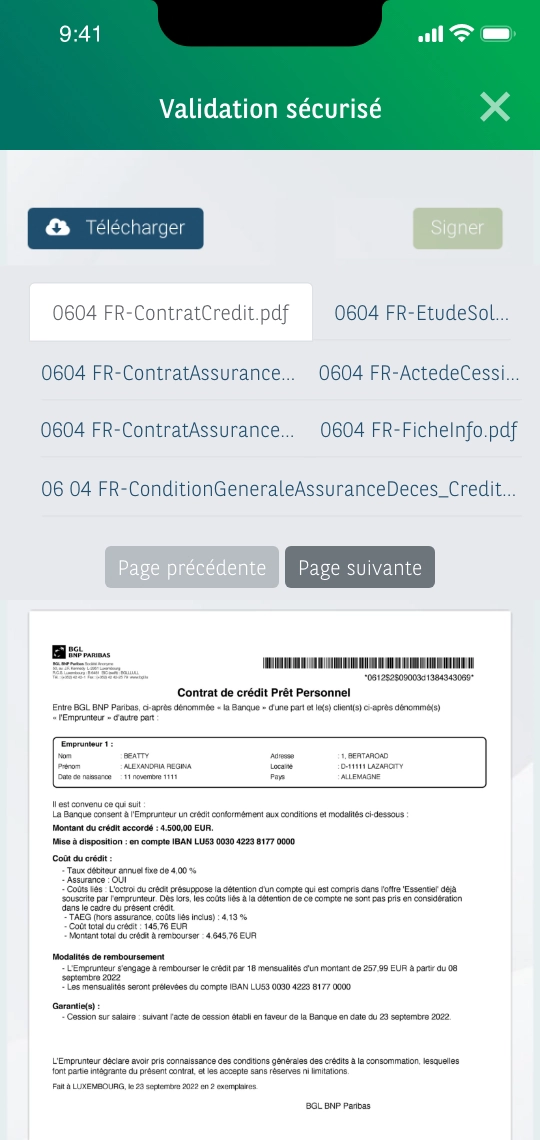
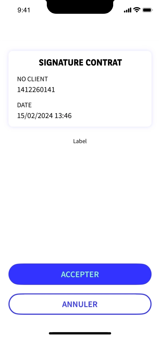
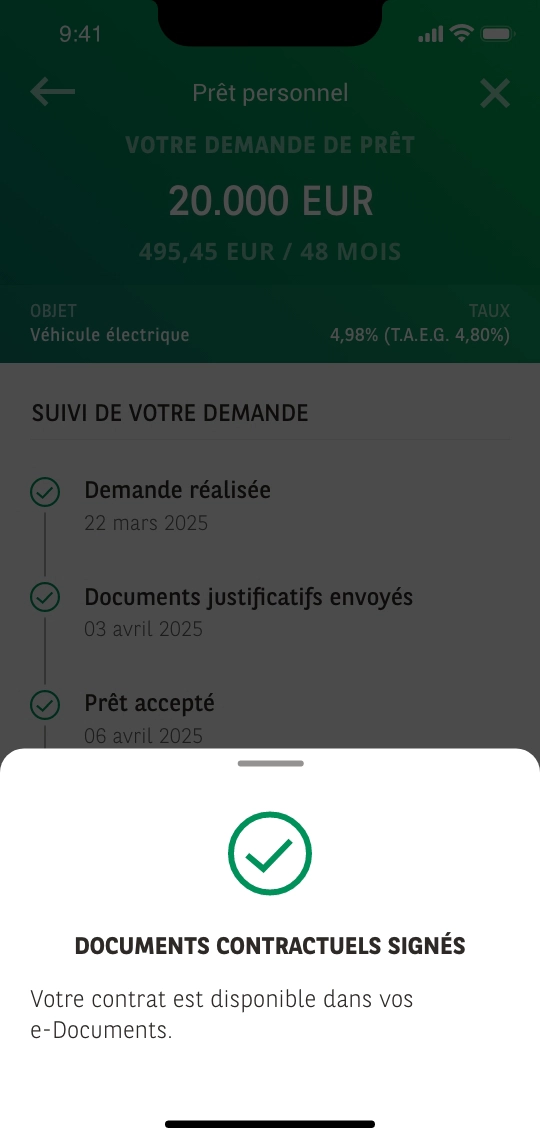
Turn the wait into a service commitment
The wireframe test showed that announcing a '1 to 2 weeks' delay was enough to put off half the testers. Rather than dressing up the wait, we reduced it: advisors committed to a reply within 3 days, if only to signal that the file is taking longer to process, and to a human call in case of refusal. Design moved the organization, not just the interface.
Synchronize joint ownership between two borrowers
When a loan has two borrowers, each signs in on their own phone. The track & trace reflects the shared file's progress consistently and in sync for both.
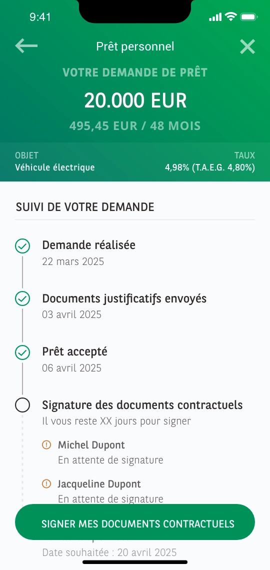
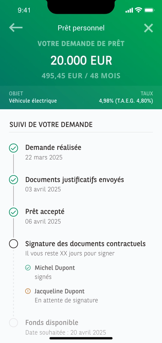
A reusable track & trace
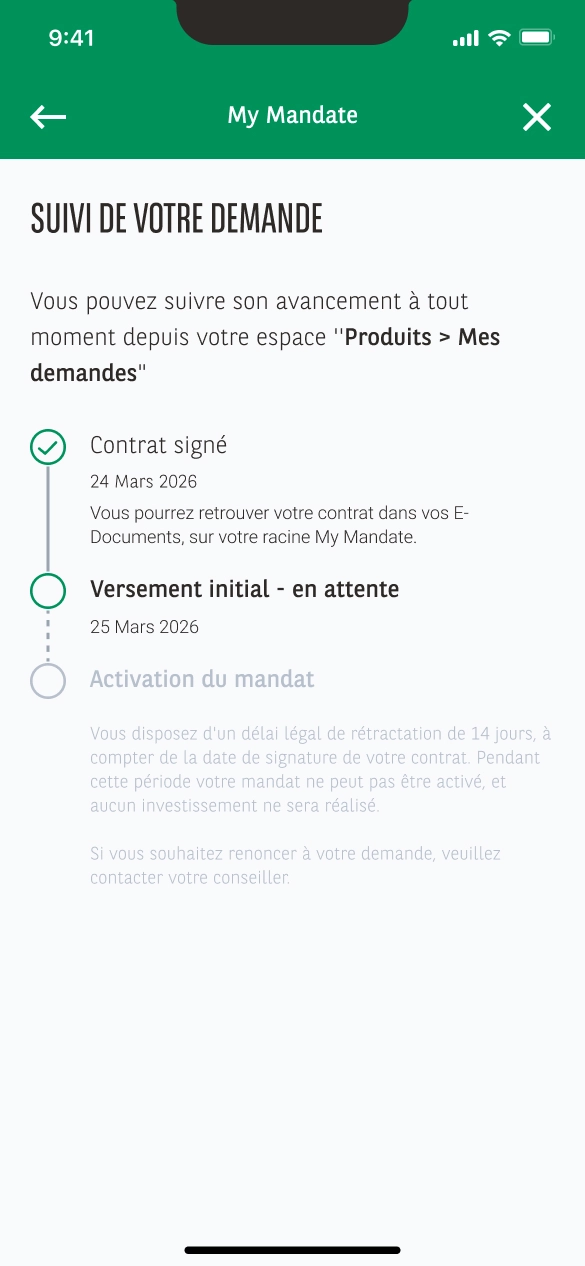
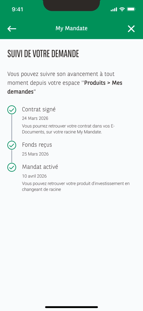
Designed as a modular brick, the file tracking was reused as-is, same base, same tracking logic, for an investment-product journey in the app. Customers find their requests in the same place, with the same codes. A design investment that pays off beyond its original project.
Results
Moderated tests confirmed the understanding of the journey: 8.2/10 on wireframes, 8.7/10 on the final prototype, and 100% of testers ready to recommend the flow and complete it without calling customer service. 'I feel confident, the documents look very formal.'
In production since late January 2026, timed to the Autofestival, the flow did more than work: within the first five months, mobile became the leading request channel, ahead of the desk (1441 requests versus 1324). 871 files were signed, in 3 min 40 s on average, a time that includes the simulation and document upload, for a request already qualified on arrival.
Above all, the flow retains and reassures: document upload more than doubled (18% → 38%), the Customer Effort Score stands at 1.6/5 against an OKR set at < 2, and customer-service calls on this topic dropped by 35%. Customers now move forward on their own, at any hour, which was exactly the goal.
Key Takeaways
"A user test can change more than screens. The real blocker wasn't the interface but a response time: removing it took a commitment from the advisors, not one more pixel."
"This was my first track & trace. The patterns I established here later shaped the tracking for the professionals' card order, a different environment, desktop, different patterns, but the same fundamentals."
"Tracking builds trust. On a long, sensitive matter like a loan, track & trace and notifications prevent the anxiety of 'where is my file?', the 35% fewer calls to customer service confirm it."