
Booking appointments online
Before this project, booking an appointment meant a call, a wait, then a callback once a slot opened up. I designed a service that lets customers book 24/7, choosing the topic, channel, and time slot themselves.
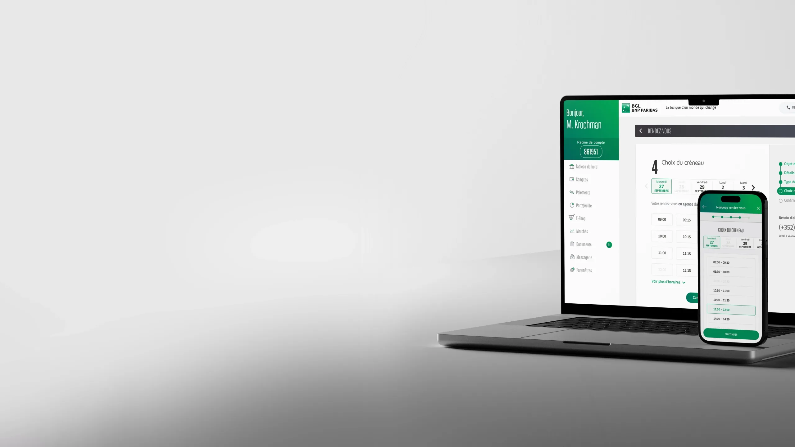
Objective
Reduce the load on customer service by letting customers book appointments independently, while automatically routing them to the right advisor and the right channel.
Measured impact, 6 months after go-live
-35%
of customer service callson relevant topics
40%
Completion rateon the MVP
stats
automatedThe bank now has automated stats on the most requested appointment topics
The Problem
Users had two options: call, or request a callback. Either way, it was customer service that called back once a slot opened up. No choice of time slot, no choice of channel, and not always the right advisor.
For the bank, manual management consumed a lot of operational time and didn't automatically generate data on the most requested appointment topics.
The challenge went beyond the interface: it was necessary to precisely qualify the appointment topic to query the right calendars, handle specific business rules (channel forced by topic, a 48h minimum delay in some cases, limit of 2 active appointments, exclusion of minors and people under guardianship), and cover special cases like foreign currency withdrawal, all without exposing this complexity to the user.
Approach
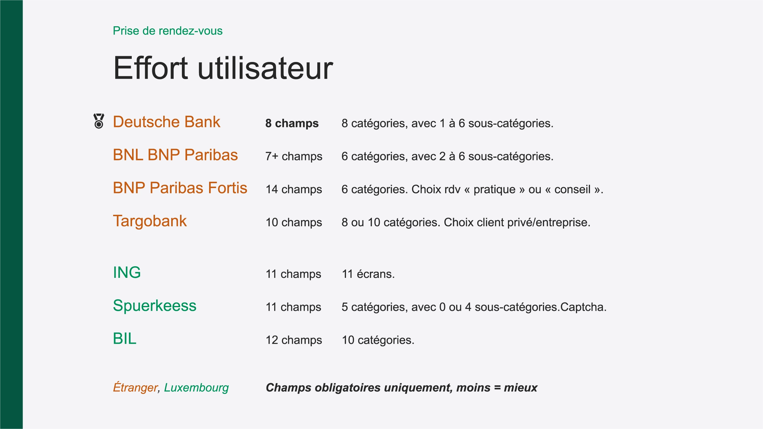
Benchmarking user effort across competitors.
I analyzed appointment booking patterns at several competing banks, measuring the user effort of each, before designing anything.
Framing business rules with customer service, branch advisors, and IT.
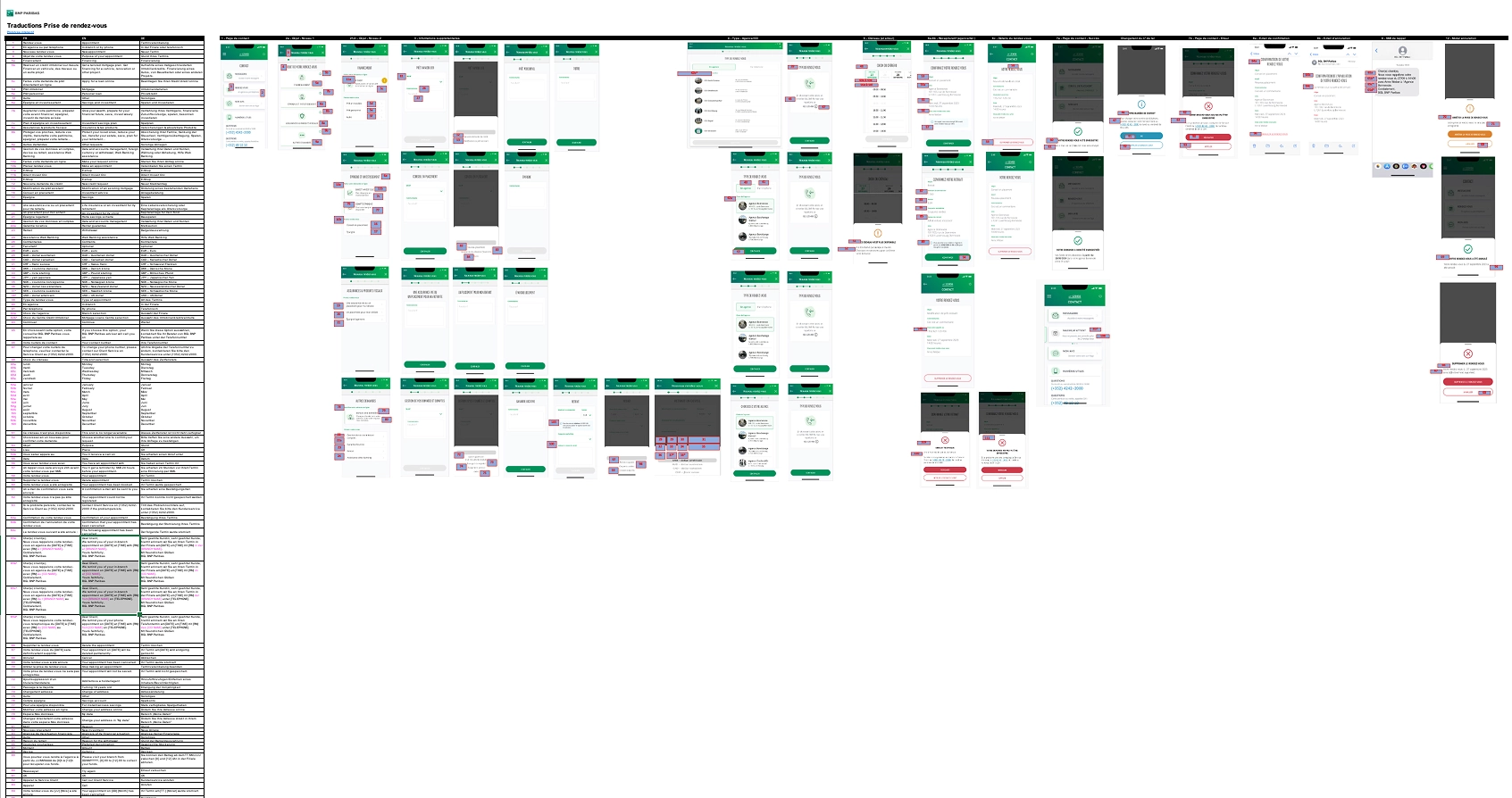
I ran the framing with PMs, BAs, IT, customer service, and branch advisors. Each appointment topic has its own rules: forced channel (phone or branch), minimum delay, target advisor. This framing directly fed the wireflow.
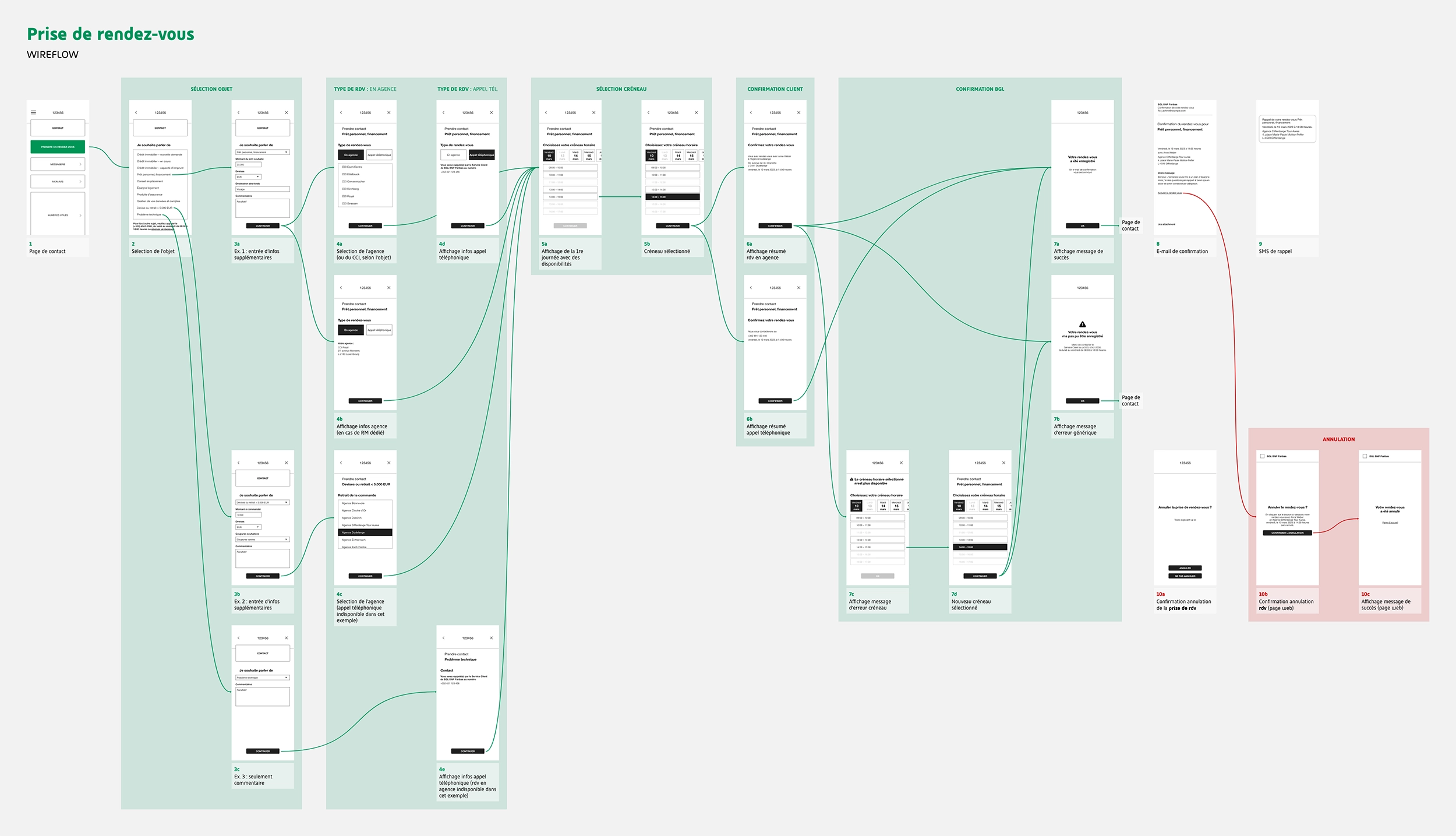
Prototyping the mobile flow.
I built the wireflow and wireframes in parallel, mobile-first. Once validated, the flow served as a baseline for the rest of the project.
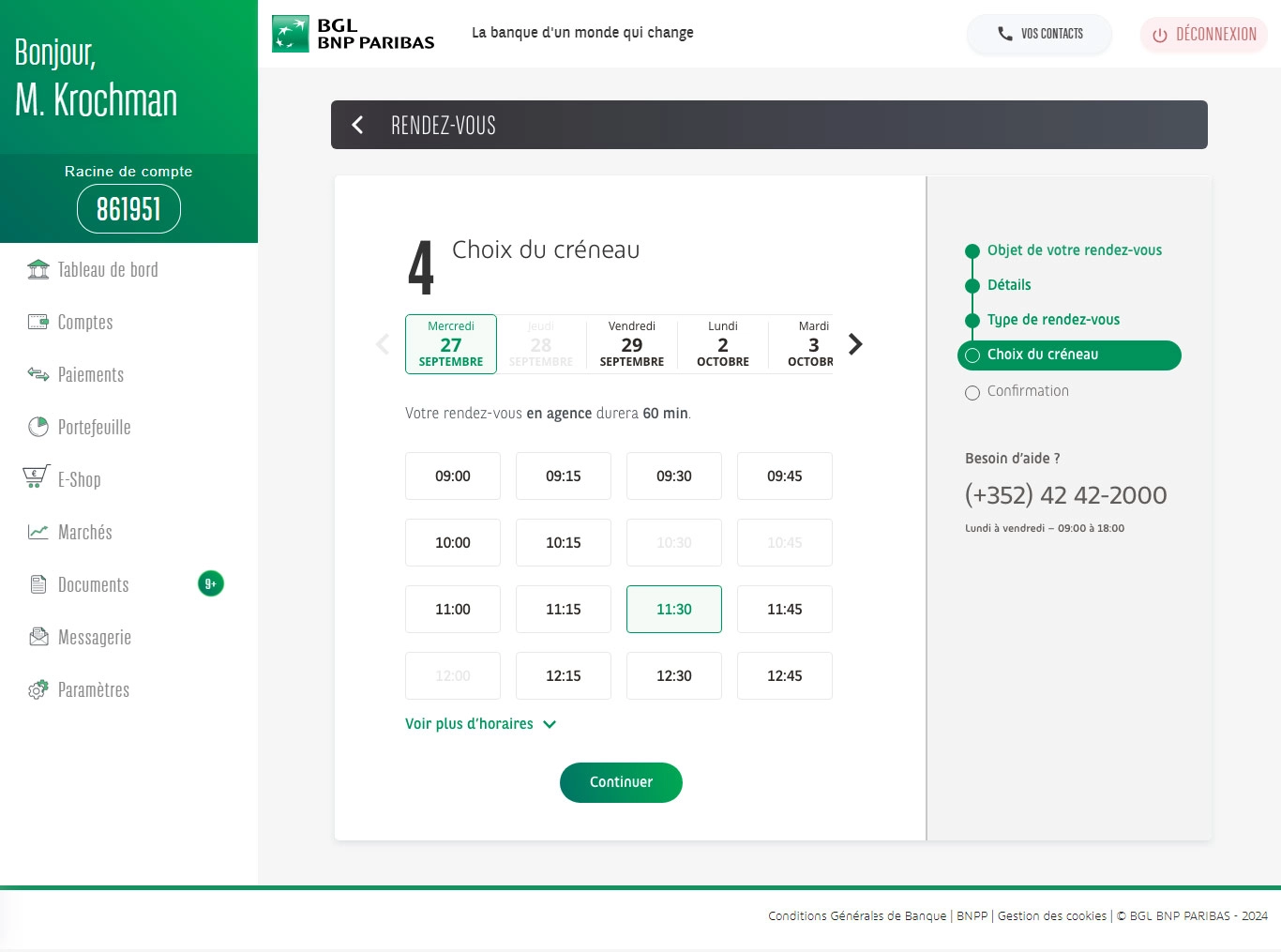
Co-building the desktop display with the developer.
During desktop development, the web developer flagged an issue I hadn't anticipated: the volume of possible time slots made the interface unmanageable. We built the solution together, a progressive display with a 'see more times' button, an approach that wouldn't have emerged without this direct collaboration.
Shipping and tracking development.
I handed over the translations with text/screen links for the developers and ran the Design Quality Check.
Key Decisions
Qualifying the topic first
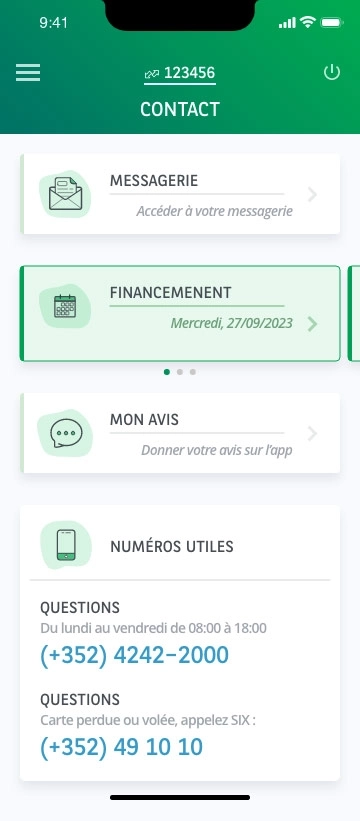
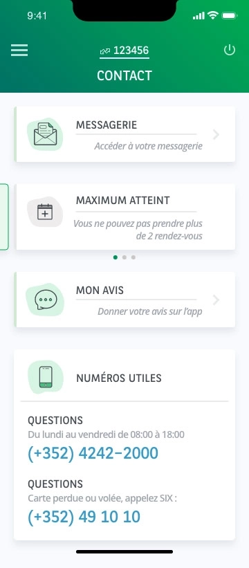
48h delay, no available slots, limit of 2 active appointments: each case has a specific message and a clear exit point, rather than a generic redirect to customer service.
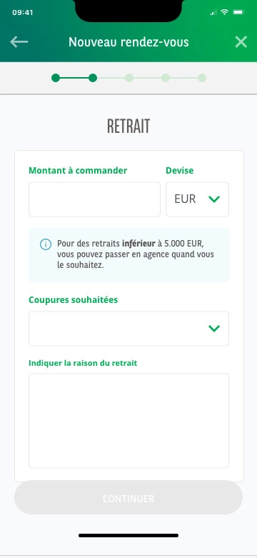
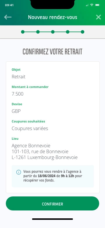
Handle the special case: foreign currency withdrawal
When selecting this topic, an information zone appears immediately (withdrawals under €5,000 in euros do not require an appointment). The amount field blocks progress until conditions are met. The user then receives a fund availability date: not a strict time slot, but the time from which they can come to pick it up.
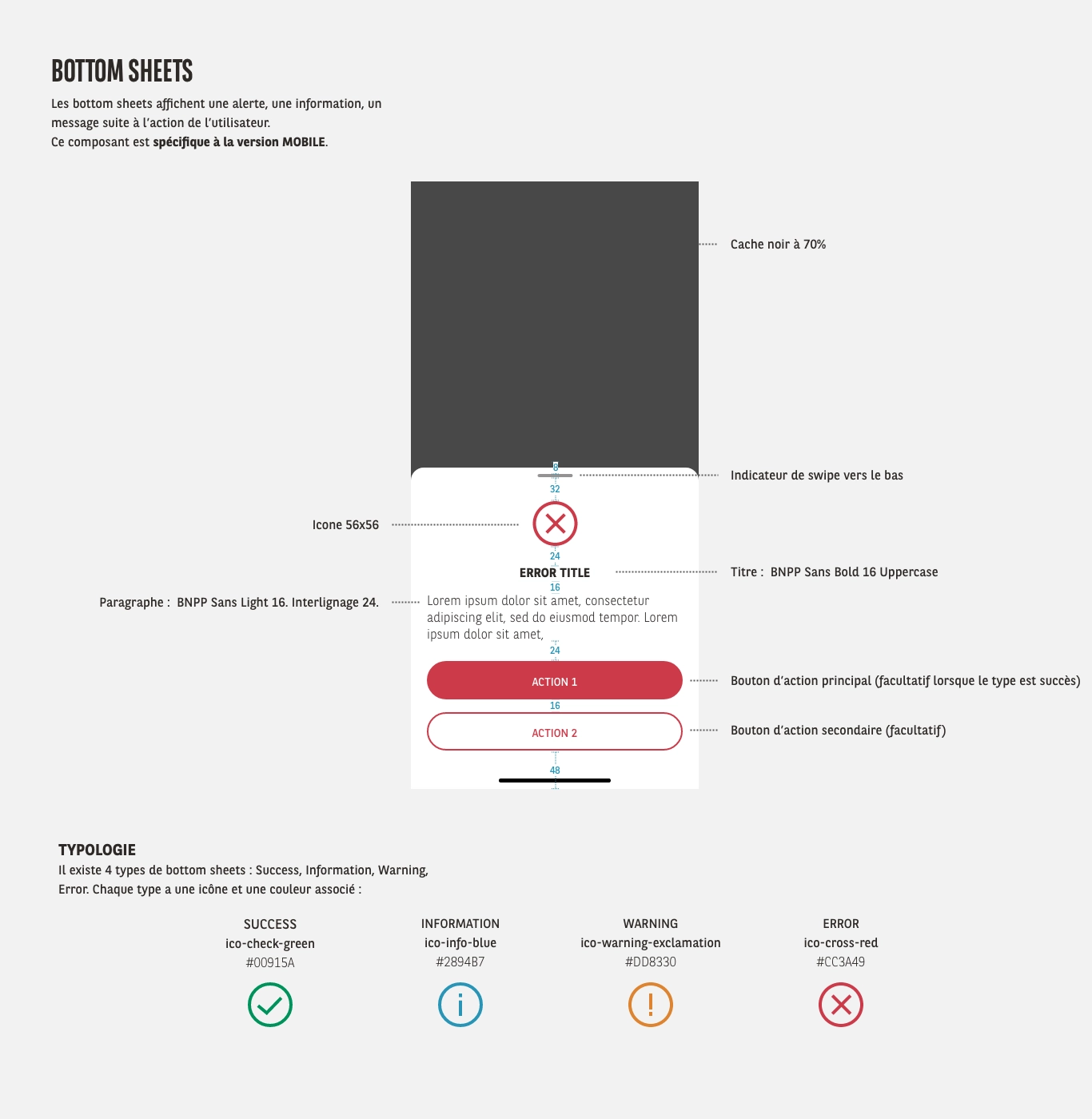
Create a contextual bottom sheet component
To display error cases, simultaneously booked slots, or deletion confirmations, I implemented a contextual bottom sheet component.
Designed to replace legacy web pop-ups, I documented it and it was reused on other projects, notably the login flow redesign.
4 variants depending on context: success (green), info (blue), warning (orange), error/deletion (red).
Add details that matter
Customer's usual branch bumped to the top of the selector. Public holidays shown as disabled in the calendar. Progress bar and summary before confirmation, so the user stays in control at every step.
Results and evidence
The MVP reduced customer service calls by 35% on the relevant topics, with a 40% completion rate upon release.
The bank now has automated statistics on the most requested topics, data that didn't exist before this project, directly feeding the prioritization of phase 2.
Production data also revealed a drop-off rate at the topic selection step. Analysis points to two causes: a real friction point in the list, and user curiosity, customers exploring without intending to book immediately.
This signal, and the technical foundations laid by this project, clearly define the scope for phase 2: simplifying the topic list, grouping them, and providing better entry signage.
Key Takeaways
"The progressive display of time slots wasn't born from a brief, it came from an issue a developer flagged during integration. The best solutions often come from this kind of collaboration beyond handover."
"The bottom sheet designed for this project was reused for the login redesign, then on every new project since. Thinking reusability from the start means contributing to the design system, not just the deliverable."